Pragmatism: designing a Figma library in the open
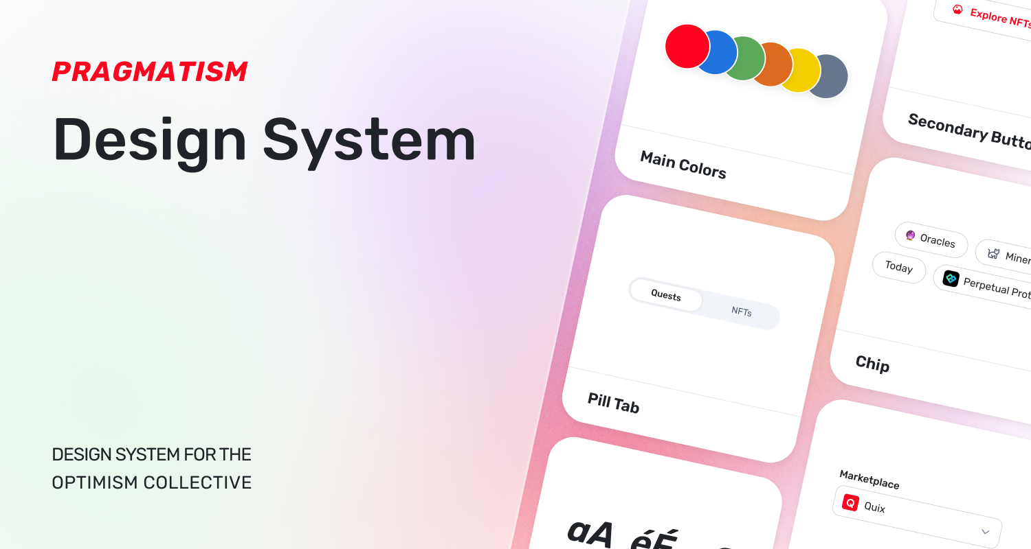
Open source and public goods are at the heart of Optimism’s ethos.
In alignment with our goal to decentralize the Optimism ecosystem, we plan to open source more and more pieces of the Collective. Today, we are very excited to publish our Figma library, Pragmatism, to the Figma community. Anyone will be able to view, fork, and leave feedback on this design system.
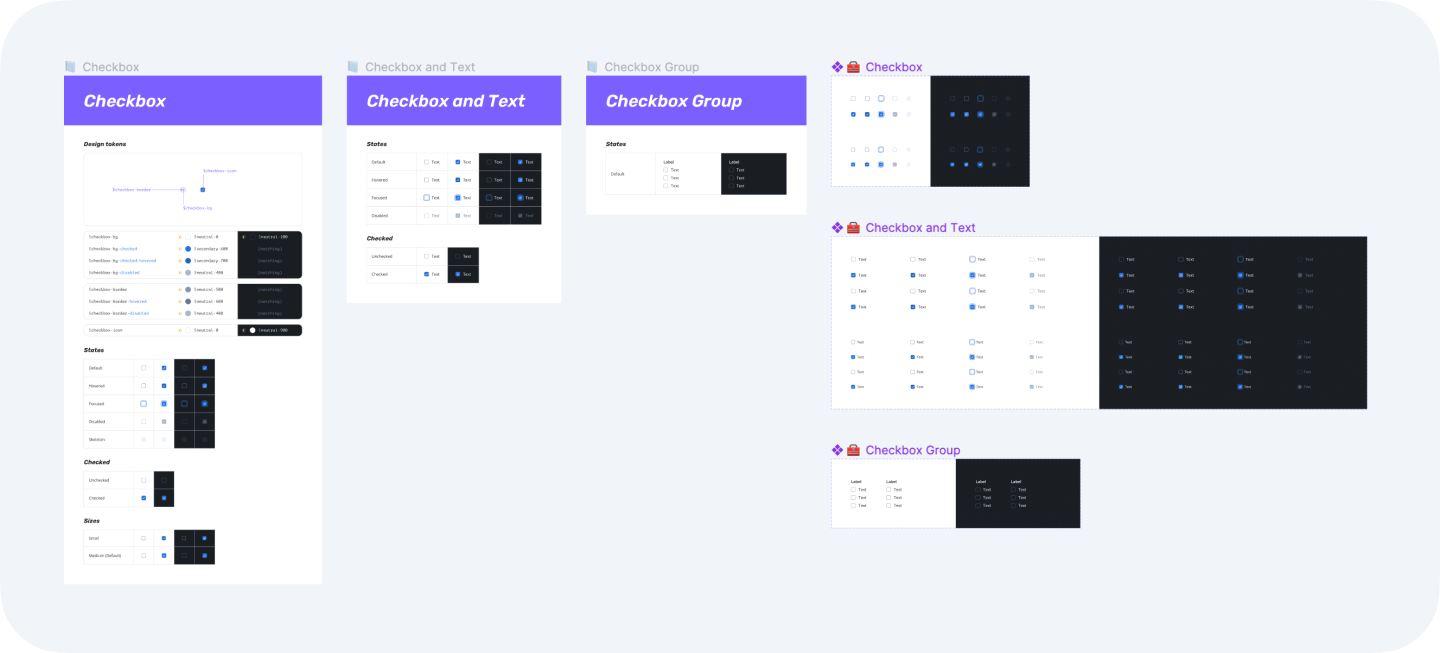
Here are some of the features that define Pragmatism:
Ongoing iteration
Pragmatism will be constantly evolving as we continue to shape the system for our needs. You won’t need to wait long periods between updates to Pragmatism, as we will publish additions and changes on a reoccurring basis. There will be a change-log for every component to help you keep track of the updates.
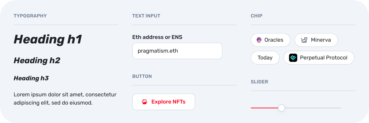
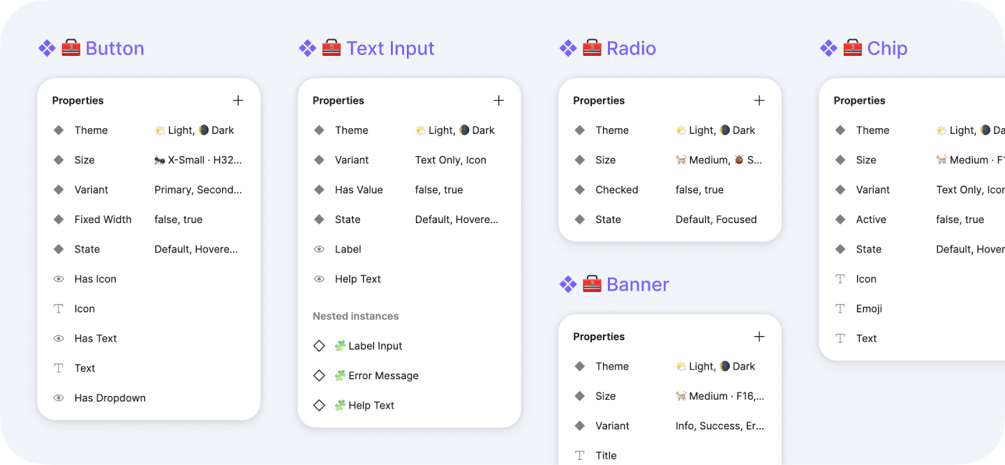
Latest Figma features
Our libraries are using the latest Figma features such as “Nested instances” and “Booleans”. Although we used plugins like Similayer to create the library, you don’t need them to update or use the library.
Easy to customize
It’s important to us that Pragmatism is easy to fork and customize for diverse use cases, whether that be when experimenting at hackathons or launching novel use cases.
One thing we are doing to help with this is documenting the usage of component design tokens but actually employing them in the components. This way, there are as few as possible shared layers to update. As an example, it would be trivial to change the primary color from red to purple.
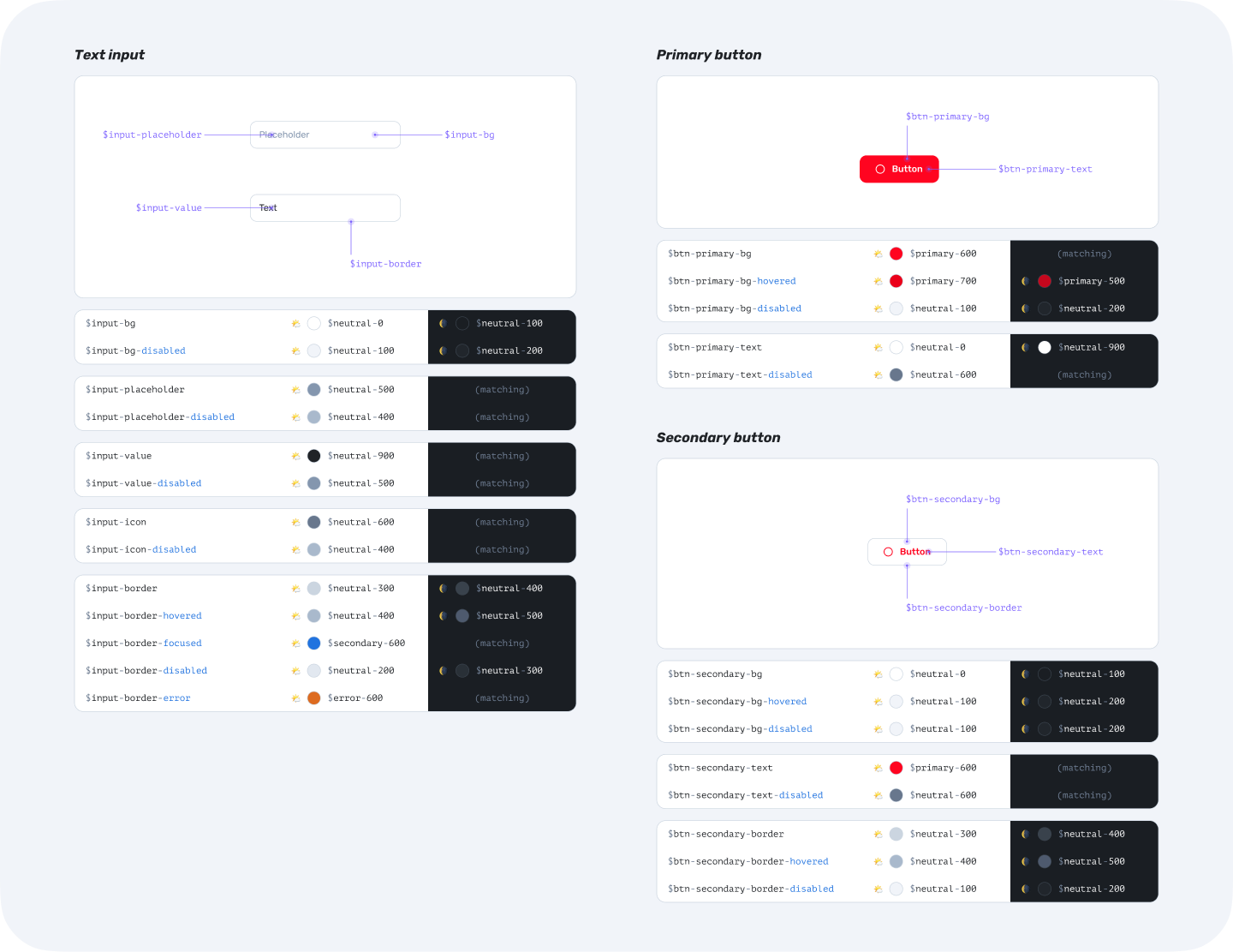
FontAwesome support
We are currently using FontAwesome for icons. This allows you to have access a wide set of icons — just type the icon name in the component to change the asset.
When necessary, we also intend to sponsor new icons like we did for hexagon-image.
Theming
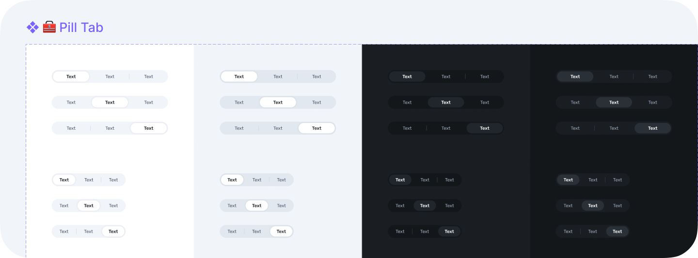
All the components have both light and dark themes as variants so it can easily be switched from the right panel in Figma, without the need for multiple libraries or external plugins.
React library and Storybook
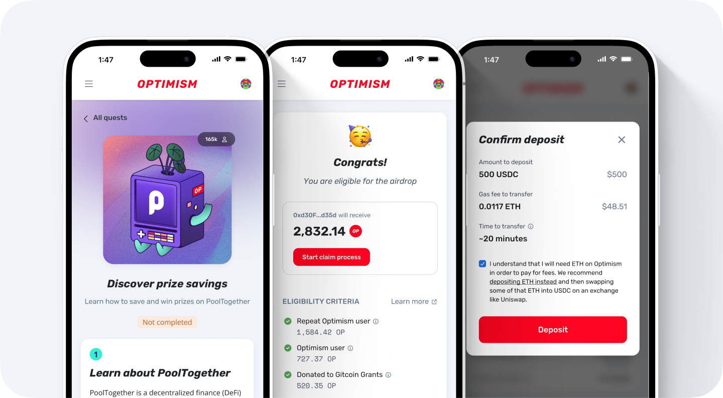
While many of Pragmatism’s components have been partially implemented on Optimism’s website, none of the design system is public yet. Next year, we plan to release a dedicated React library and Storybook front end so that anyone can view and use the component code.
What Pragmatism isn't
Defining what Pragmatism isn’t is as important as defining what it is. If you plan on using the library for your personal or work designs, these limitations may help you judge for yourself if Pragmatism is the right fit for your project.
Here are things we don’t plan on doing:
- Supporting internationalization (Pragmatism will be in English/US).
- i18n is very important and we plan to document and code behaviors that could arise when localizing the app. However, we currently don’t plan to have i18n variants in our Figma library because of the maintenance overhead. An example is right-to-left languages that would need dedicated variants.
- Having all of the states of a component as variants.
- Some states like “Focused” will be variants when often used in mocks (e.g. Text input), while it might just be documented for other components (e.g. Pill tab).
- Adding “web2 only” components. We will only add components that makes sense in a web3 context (for example, we are unlikely to add address inputs or credit card inputs).
Extensions packs
Today we are releasing our core Figma file. In the future, we plan to make the many extensions we have public—be they layout (bridge header and footer) or assets (token logos, app logos, 3rd party partner color, etc.).
Feedback welcome
Let us know what you think and what should be changed by leaving feedback in the Figma file. We look forward to reading it!
We hope Pragmatism makes your next design project easier and more organized. After all, just because you're Optimistic doesn't mean you can't also be Pragmatic!
